A tiny JavaScript library to easily toggle the state of any HTML element, and create UI components in no time.
Dropdown, navigation button, tooltip, collapsible panel, lightbox, tabs, switch like above to change theme…
UI components made in minutes without worried about JavaScript. Only set a few HTML attributes, and code the rest with your CSS skills.
Why?
A front-end developer often has to code scripts for interface components. Components such as dropdowns, navigation buttons, tooltips, expandable panels, lightboxes, tabs, etc.
The thing is… Most of these components expose a recurrent behavior: a trigger element toggles the state of one or more target elements. So why not code this behavior once and for all?
So here is a solution: a simple script to toggle the state of a trigger element with a CSS class. You can then associate this element with one or more others: let’s call them targets. By adding the right HTML attributes, it can adapt to any contexts and behave like a chosen component.
Only focus on adjusting the rest with your CSS creativity.
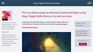
Demo page
Here is a full demo page where you can find some examples of Easy Toggle State real use cases. In this page, each interactible element is managed with the library, without any JavaScript more.
Examples
Here are some demos to show you how this is powerful.
Of course, these examples can be made in other ways, with Easy Toggle State or not. For example, checkboxes, switchboxes and radio buttons can be made in pure CSS using natives inputs and labels.
Checkbox
You want to display a checkbox, i.e. a box with a checkmark that appears on click on this box.
Even if you should use the <input type="checkbox"> native component, in some cases, you can’t.
Switchbox
You want to display a switchbox, i.e. a box with a "ball" that moves on click on this box.
Even if you should use the <input type="checkbox"> native component, in some cases, you can’t.
Radio buttons
You want to display some radio buttons, i.e. some circles which are filled on click on them, only one at a time.
Even if you should use the <input type="radio"> native component, in some cases, you can’t.
Tooltip
You want to put a tooltip on a text, i.e. show an element when hovering this text, and hide it when the cursor leaves this text.
In most of cases, tooltips are not a good idea for displaying information, and are not accessible to all, screen readers for instance, so please consider not using it, or only for trivial contents.
Collapsible panel / accordion
You want to create a collapsible panel, i.e. a frame, with some content, that can be collapsed on click on a button.
Even if you should use <details> and <summary> HTML elements, in some cases, you can’t.
Tabs
You want to create some tabs, i.e. some panels visualizable by clicking on their associated button.
Dropdown
You want to create a dropdown, i.e. a list of choices that appears when you click on a button. Of course you should use <select> and <option> HTML elements, but in some cases, you can’t.
Note that Easy Toggle State do not deal with data, so it will not change trigger’s value when clicking on a option. Here, an event listener on click has been added on each option to handle this for this demo.
Dialog
You want to create a dialog, i.e. an information or form box displayed in front of all page content on click on a trigger.
Even if you should use <dialog> HTML element, in some cases, you can’t.
Lightbox
You want to create a lightbox, i.e. a box displayed in front of all page content to see a larger version of an image.
Quickstart
Locally
- Direct download
- Or choose another version: ES5 or ES6
Then, add the script into your page:
<script src="./your-path/easy-toggle-state.min.js"></script>and it’s done.
From CDN
Easy Toggle State is available on some CDN, so you can link it directly from there instead of using it locally.
Go check easy-toggle-state on cdnjs, or use unpkg API.
With NPM
Install with npm:
npm install easy-toggle-stateThen use Easy Toggle State into your application, inside your JS file:
import easyToggle from "easy-toggle-state";
easyToggle();
For example, you could make sure your DOM is fully loaded before initializing Easy Toggle State in your page. To do so:
import easyToggle from "easy-toggle-state";

const handler = () => {
	easyToggle();
	document.removeEventListener("DOMContentLoaded", handler);
};
document.addEventListener("DOMContentLoaded", handler);
Refer to the API using ES modules section to learn more about what you can do.
Browser support
Easy Toggle State library is written in ES2016+, so it supports browsers back to Edge 14, Firefox 43, Chrome 47, Safari 9 and Opera 34.
For more compatibility, you can use the ES5 version, making the library supports browsers back to IE 10, Edge all versions, Firefox 4, Chrome 13, Safari 6 and Opera 12.1.
If you need even more browser compatibility, consider using polyfill.io in addition of the ES5 version. This will make the bundle supports back to IE 8.
How to use
First recommendation
Although you could use any element, I strongly recommend using only buttons for trigger elements. It’s more accessible, and it’s meant to be used for this kind of thing. The examples will show you that.
If you still want to use links with fake href values, such as href="#", don’t forget to add role="button" attribute.
Toggling
Basis: defining a trigger
- Attribute:
data-toggle-class -
<button data-toggle-class>…</button>Here is the basic usage: Adding this attribute on a button will make it toggle the CSS class
is-activeon it on click. It becomes a trigger.<button data-toggle-class="is-selected">…</button>You can specify a class name of your own that you want to toggle instead: Here, by clicking on this trigger, the class
is-selectedwill be toggled on it on click.<button data-toggle-class="class1 class2 class3">…</button>You can go further into toggling by filling the attribute with as many classes as you need: Here, a click on the trigger will toggle each class on it.
Toggling only on trigger
- Attribute:
data-toggle-on-trigger -
<button data-toggle-class-on-trigger="class1 class2 class3">…</button>Since you are able to specify a target, you may want to toggle some classes only on the trigger. Here, each of those three classes will be toggled only on this trigger.
Toggling with a target
You may want to add a target to your trigger.
<button data-toggle-class="class" data-toggle-target="selector">…</button>This way, the class specified in the attribute data-toggle-class will be toggle on this trigger and on its target, defined by the selector.
Toggling only on target
- Attribute:
data-toggle-on-target -
<button data-toggle-class-on-target="class1 class2 class3" data-toggle-target="selector">…</button>You may want to toggle some classes only on the target. Here, each of those three classes will be toggled only on this target.
Note that this attribute must be used with one of the targeting attributes.
Toggling combinations
You can combine all toggling attributes, making Easy Toggle State compatible with any CSS framwork.
<button
	data-toggle-class="is-open"
	data-toggle-class-on-trigger="text-white font-bold bg-blue"
	data-toggle-class-on-target="text-gray bg-white"
	data-toggle-target="#plop">
	…
</button>
Here, with this combination, a click on this trigger will toggle:
- the classes
is-open,text-white,font-bold,bg-blueon this trigger - the classes
is-open,text-gray,bg-whiteon the target, the element#plop
Targeting
Basis: defining a target
- Attribute:
data-toggle-target -
<button data-toggle-class="class" data-toggle-target="selector">…</button>This is the basics in targeting: the attribute
data-toggle-targettells this trigger to look in the whole page for one or several elements to target matching the selector.This way, a click on the trigger will toggle the class on the trigger itself and on its one or several targets.
The
selectorvalue must be a valid CSS selector string, containing one or more selectors to match. Learn more about CSS selectors.
Targeting from the parent
- Attribute:
data-toggle-target-parent -
<button data-toggle-class="class" data-toggle-target-parent="selector">…</button>Instead of looking in the whole page, you can search for one or several targets matching the selector only inside the trigger’s parent container.
Targeting within the trigger
- Attribute:
data-toggle-target-self -
<button data-toggle-class="class" data-toggle-target-self="selector">…</button>Instead of looking in the whole page, you can search for one or several targets matching the selector only inside the trigger itself.
See an example with this checkbox.
Targeting the previous sibling element
- Attribute:
data-toggle-target-previous -
<button data-toggle-class="class" data-toggle-target-previous>…</button>You can target the previous direct sibling element by using
data-toggle-target-previousattribute.
Targeting the next sibling element
- Attribute:
data-toggle-target-next -
<button data-toggle-class="class" data-toggle-target-next>…</button>You can target the next direct sibling element by using
data-toggle-target-nextattribute.
Advanced
Active by default
- Attribute:
data-toggle-is-active -
<button data-toggle-class="class" data-toggle-is-active>…</button>Specify a trigger element and its targets to be active by default. As a consequence, they will be toggled once on initialization.
See an example with tabs.
Grouping triggers
- Attribute:
data-toggle-group -
<button data-toggle-class="class" data-toggle-group="name">…</button>
<button data-toggle-class="class" data-toggle-group="name">…</button>
Specify that a trigger is a part of a group, defined by a
name. Only one trigger of a group can be active at a time. Of course, it must be used on at least two triggers to create a group.They will actually behave like an accordion component.
- Attribute:
data-toggle-radio-group -
<button data-toggle-class="class" data-toggle-radio-group="name">…</button>
<button data-toggle-class="class" data-toggle-radio-group="name">…</button>
Specify that they are a part of a radio group, defined by a
name. Only one trigger of a radio group can be active at a time. Of course, it must be used on at least two triggers to create a group.Unlike a simple group as seen above, as soon as a trigger of a radio group has been activated, this radio group will always keep one trigger active. It will actually behave like radio buttons or tabs component.
Note that a trigger of a radio grouped can’t have
data-toggle-outside[?] ordata-toggle-escape[?] behavior.
Toggle on another event
- Attribute:
data-toggle-event -
<button data-toggle-class="class" data-toggle-event="event">…</button>Specify another event to toggle the trigger instead of the
clickevent used by default. For example,mouseover.See an example with a tooltip.
Toggle off when outside
- Attribute:
data-toggle-outside -
<button data-toggle-class="class" data-toggle-outside>…</button>When a trigger is active, specify to toggle off this trigger when you click again outside of it. If you use the
data-toggle-event[?] attribute too on the trigger, the event used is the same.Note that this attribute does not work on an element with
data-toggle-radio-group[?].See an example with a dropdown.
- Attribute:
data-toggle-outside-event -
<button
		data-toggle-class="class"
		data-toggle-outside
		data-toggle-outside-event="event">
		…
</button>
When using
data-toggle-outside[?] attribute, add this attribute to use a different event to toggle off outside of the trigger.Note that this attribute only works when used in addition of
data-toggle-outside[?] attribute.See an example with a tooltip.
Keyboard support
- Attribute:
data-toggle-escape -
<button data-toggle-class="class" data-toggle-escape>…</button>Specify that you can press the escape key to toggle off the trigger when it is already active.
Note that this attribute does not work on an element with
data-toggle-radio-group[?].See an example with a collapsible panel.
- Attribute:
data-toggle-arrows -
<button data-toggle-class="class" data-toggle-arrows data-toggle-group="name">…</button>
<button data-toggle-class="class" data-toggle-arrows data-toggle-group="name">…</button>
Used with a group attribute, specify that as soon as a trigger is focused, you can navigate through the triggers of the same group with arrows ↑ → ↓ ←, home and end keys.
Remember that this attribute must be used with
data-toggle-group[?] ordata-toggle-radio-group[?].See an example with radio buttons.
Targeting a modal
- Attribute:
data-toggle-modal -
<button data-toggle-class="class" data-toggle-modal>…</button>Specify that the target is a modal, such as a dialog or a lightbox. This way, when the target is active (open), the focus is trapped inside this target until you close it. This means tabbing will only focus on focusable elements inside this target, leaving anything else outside be out of scope.
Be very careful when using this feature. A focus trap can be very annoying (and an accessibility fault) when used in a wrong way, so be sure your target is a modal component.
Closing button
- Attribute:
data-toggle-trigger-off -
<button data-toggle-class="class" data-toggle-target="#plop">…</button>

<div id="plop">
	<button data-toggle-trigger-off="#plop">…</button>
</div>
This attribute is meant to be used on an element inside a target. By doing so, it enables this element to toggle the related trigger back off when it is active. For example, a close button inside a dialog or a lightbox.
Fill this attribute with a CSS selector matching that target element.
Remember that this attribute must be used on an element placed inside a target element.
Accessibility
If a trigger or a target element has one of the supported ARIA attributes, its value will also change, so please consider using the right roles and ARIA attributes to optimize your components for accessibility.
The examples will help you for that. Learn more about ARIA.
The ARIA attributes supported by Easy Toggle State are:
aria-checkedaria-expandedaria-hiddenaria-pressedaria-selected
Customization
You can change the prefix toggle in data-toggle-class and other attributes to prevent conflict with another JS library. To do so, add this attribute to your <html> element with your new prefix:
<html data-easy-toggle-state-custom-prefix="my-prefix">It will so be set to all attributes like data-my-prefix-class.
API
API using the bundle (locally or from CDN)
initialization
Initialize all trigger elements not yet binded.
window.easyToggleState();No parameter. Returns an Array of newly initialized trigger elements.
unbind
Unbind a trigger element, or a trigger element list.
window.easyToggleState.unbind( Node || NodeList );Takes a Node or a NodeList as parameter. Returns the same Node or NodeList.
unbindAll
Unbind all trigger elements.
window.easyToggleState.unbindAll();No parameter. Returns a NodeList of all newly unbinded trigger elements.
isActive
Get the state of a trigger element.
window.easyToggleState.isActive( Node );Takes a Node as parameter. Returns a boolean.
API using ES modules
initialization
Initialize all trigger elements not yet binded.
import initialize from "easy-toggle-state";
initialize();
No parameter. Returns an Array of newly initialized trigger elements.
unbind
Unbind a trigger element, or a trigger element list.
import { unbind } from "easy-toggle-state";
unbind( Node || NodeList );
Takes a Node or a NodeList as parameter. Returns the same Node or NodeList.
unbindAll
Unbind all trigger elements.
import { unbindAll } from "easy-toggle-state";
unbindAll();
No parameter. Returns a NodeList of all newly unbinded trigger elements.
isActive
Get the state of a trigger element.
import { isActive } from "easy-toggle-state";
isActive( Node );
Takes a Node as parameter. Returns a boolean.
Hooks
You can also add some hooks: each trigger and target element fires a toggleBefore event before and a toggleAfter event after toggling its state, so you can add event listeners on these events, and test the active state.
For example:
document.querySelector("#myTrigger").addEventListener("toggleAfter", event => {
	console.log(`Active: ${window.easyToggleState.isActive(event.target)}`);
}, false);
Contribution
- Clone the repo:
git clone https://github.com/twikito/easy-toggle-state.git - Development:
npm run build - Fork repository on GitHub
- Report a bug
- Suggest a feature